The Golden Gate Bridge – or how an accidental colour became a global icon
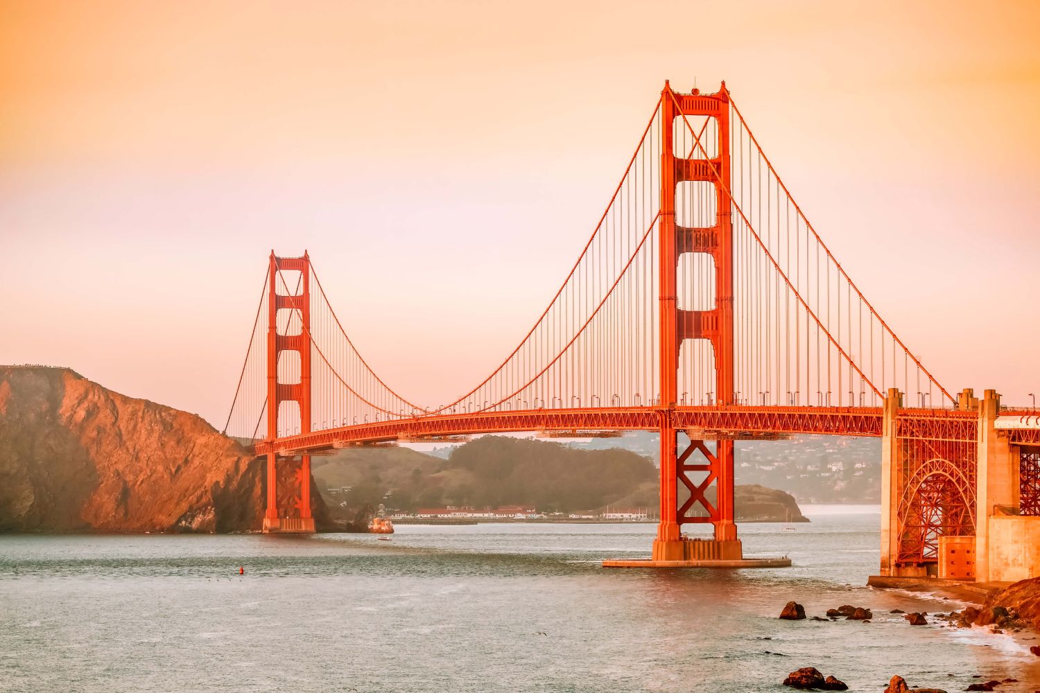
The Golden Gate Bridge, one of the most recognisable landmarks in the world, stands as a testament to human ingenuity and aesthetic brilliance. Connecting San Francisco to Marin County, this marvel of engineering is not just celebrated for its functionality but also for its unique and vibrant colour—International Orange. Surprisingly, this now-iconic tone was not part of the original plan and here is the story behind it.
In the early 20th century, the Golden Gate Strait - a turbulent waterway separating San Francisco Bay from the Pacific Ocean - posed a significant challenge to transport and commerce. Ferrying people and goods across the bay was inefficient, so the idea of a bridge began to take shape. Despite initial scepticism from engineers and financiers, Chief Engineer Joseph Strauss championed the project, overcoming numerous logistical and environmental challenges.
Construction began in 1933 amidst the Great Depression, providing jobs for thousands. When the bridge was completed in 1937, it was the longest suspension bridge in the world, stretching 4,200 feet between its towers. However, while the engineering feats were groundbreaking, the story of the bridge’s colour remains equally compelling.
The original plans for the Golden Gate Bridge focused solely on functionality, leaving aesthetics as an afterthought. Early proposals suggested painting the bridge either grey, to blend with the skyline, or black with yellow stripes, to enhance visibility for ships navigating the foggy waters.
However, as construction materials arrived at the site, they were coated in a reddish-orange primer, a protective layer to prevent rust during transportation. This vibrant hue immediately caught the eye of Irving Morrow, the consulting architect for the project. Morrow saw the potential of the reddish-orange primer not just as a base but as the defining colour of the bridge itself.
Irving Morrow was not initially involved in the structural design of the Golden Gate Bridge, but his architectural expertise and artistic sensibilities proved invaluable. Morrow believed that the bridge needed a colour that balanced practicality and beauty, complementing the natural surroundings while ensuring visibility in San Francisco’s frequent fog.
The primer’s reddish-orange tone, later refined into International Orange, ticked all the boxes. It contrasted sharply with the surrounding landscape - the blue water, green hills and grey skies - creating a bold yet harmonious aesthetic. Furthermore, the colour provided high visibility for ships navigating the strait, meeting safety requirements without resorting to the original jarring black-and-yellow scheme.
Morrow successfully convinced Strauss and the bridge's stakeholders to adopt the colour, cementing his role as a pivotal figure in the bridge's legacy.
Why international orange?
The colour known as International Orange was not new. It was already in use by the military and aerospace industries for its high visibility and resistance to fading under harsh weather conditions. Its technical properties made it an excellent choice for a bridge exposed to the salty air and relentless fog of the San Francisco Bay.
The vibrant hue ensured that the bridge remained visible in heavy fog, reducing the risk of accidents for ships navigating the Golden Gate Strait. The colour harmonised with the natural environment while making a bold visual statement and the paint’s resilience to weathering and fading was ideal for the bridge’s harsh conditions.

San Francisco’s iconic fog, locally known as “Karl,” played a significant role in the bridge’s design and colour choice. The thick mist often obscures much of the city, creating a dreamy, otherworldly atmosphere. A less vibrant colour would have made the bridge nearly invisible during foggy days, diminishing its safety and grandeur.
Thanks to its bright and warm tone, International Orange ensures that the bridge remains visible even on the foggiest days, creating a striking contrast against the muted grey backdrop.
Over the years, the Golden Gate Bridge's colour has become synonymous with San Francisco’s identity. Millions of tourists flock to the city every year to capture its majestic beauty, often bathed in the golden hues of sunrise or partially shrouded in fog. The colour has transcended its functional origins to become a cultural icon, inspiring artists, filmmakers and photographers worldwide.
Films like Vertigo and Pacific Rim have prominently featured the bridge, using its vibrant colour to enhance dramatic visuals. Similarly, countless postcards, paintings and advertisements showcase the bridge’s distinctive hue as a symbol of innovation, resilience, and beauty.
The challenges of preservation
While International Orange is stunning, maintaining the colour and integrity of the Golden Gate Bridge is no small feat. The bridge undergoes continuous maintenance, with a dedicated team of painters working year-round to combat rust and ensure that the colour remains vibrant.
Contrary to popular belief, the bridge is not repainted from end to end - instead, the team focuses on areas needing touch-ups. The paint used today is a high-performance, environmentally friendly coating that adheres to modern safety and environmental standards while retaining the iconic International Orange hue.
The specific formula for International Orange used on the bridge is unique and differs from other variations of the colour in aerospace or industrial applications. During its construction, some residents were sceptical of the colour choice, calling it too bold. Today, however, it’s hard to imagine the bridge in any other hue. The success of the Golden Gate Bridge’s colour has also inspired other iconic landmarks, such as Tokyo Tower, which also uses a variation of orange for visibility and aesthetic impact.
The Golden Gate Bridge’s story is more than just one of engineering or colour - it’s a metaphor for creativity, adaptability, and the unexpected beauty that can arise from practical solutions. Its vibrant hue, born from an anti-rust primer, is a reminder that some of the best innovations happen by accident.
The Bridge is a masterpiece that blends functionality with artistry. Its International Orange colour, originally a practical choice, has become a global symbol of innovation and aesthetic brilliance. Thanks to Irving Morrow’s vision and a bit of serendipity, the bridge continues to captivate millions while serving as a vital transportation link.
So, the next time you gaze at the Golden Gate Bridge, remember that its iconic colour was not just about beauty or visibility - it was about embracing the unexpected and turning it into something extraordinary.
Additional Articles

How early humans built shelters without tools
Long before cranes, concrete, or even the simplest hand tools, early humans were already addressing one of construction’s most fundamental challenges - how to create shelter using only what the...
Read moreThe surprising origins of insulation in construction
When you think of insulation today, materials like mineral wool, rigid foam and multi-layer systems probably come to mind. But long before modern products and performance standards, builders relied...
Read more

Why some structures were built to be flawed
Walk through historic buildings, particularly religious ones and you might notice something subtle such as a column slightly off alignment, a pattern that breaks unexpectedly, or a feature that feels...
Read more